I might not be OK... But it's ok.
Overview:
Creating a colorful and playful visualization to break the stigma of mental health.
It's like catching a cold for your mind. That's it. I mean it should be as easy as this, but unfortunately, we still struggle with the stigma of mental health, talking about it, sharing and asking for health although, during last years, there's been huge progress.
I see the delivery of this project as an app, you might see it as an Instagram effect ( which is true) but from now on I'm gonna call It, Spica.
Objectives:
-Create a playful experience that helps you to see the term in a more comforting tone
-Break the harshness of scientific terminologies
-Making it easy to share and reach out for help
-Giving a scale to emotional states and make it easy to measure
I decided to use the Design Sprint framework for this project. So I started with understanding and defining the problems first. Trying to see the matter from different perspectives helps you a lot especially when It's about a new area. The Next step was diverging. Creating as much as possible ideas and solutions and might work or not. In this step, we don't need to worry about the quality of ideas as it's just about quantity. More is better!
Next step is converging. Now we need to force to find the best from the list of ideas that we created before. This also is the right time to play with the chosen idea and make it a bit better if you will.
Building something quick and playable is the next step. Although it's alright to not dive into the details in this level I preferred to spend a bit more time to make sure I'm testing on a good level of visual design as a big part of this project is to be visually appealing.
After prototyping your idea, now it's time to face the truth. I asked a few people to try the initial concepts, watched them using it and at the end asked them to talk about it. I divided the folks( 26 people, 15 men and 11 women) into two groups and asked my wife to get one of the group's feedback without me. It was interesting how they could be kind( and not genuinely honest) when they talk to your face. As a result, I need to come up with another approach for upcoming feedback sessions.
I made a few changes after two rounds of feedback and I still have plans to make it better but, please consider this project as an on-going one and feel free to share your thoughts.
Research phase:
After studying a bit about mental health and emotional states I found that many times it seems harder when you don't fit the feelings into a measurable scale. Also, it's always good to share and ask for help but it's not easy as you might get labelled. So I should have found a way to make it fun and not too serious. Bear in mind that I'm not trying to provide a solution or treatment in any words.
My main goal is to destroy this blown empty monster that blocks us from seeing what is needed to be seen.
During my research, I found an interesting graph called the wheel of emotions. ( more info here) This gives me a good reference for dealing with colors. As it's a completely non-mathematical matter, I thought going abstract would be one of the best approaches, although I tried a few other ways and you might agree with me after going through the sketches.
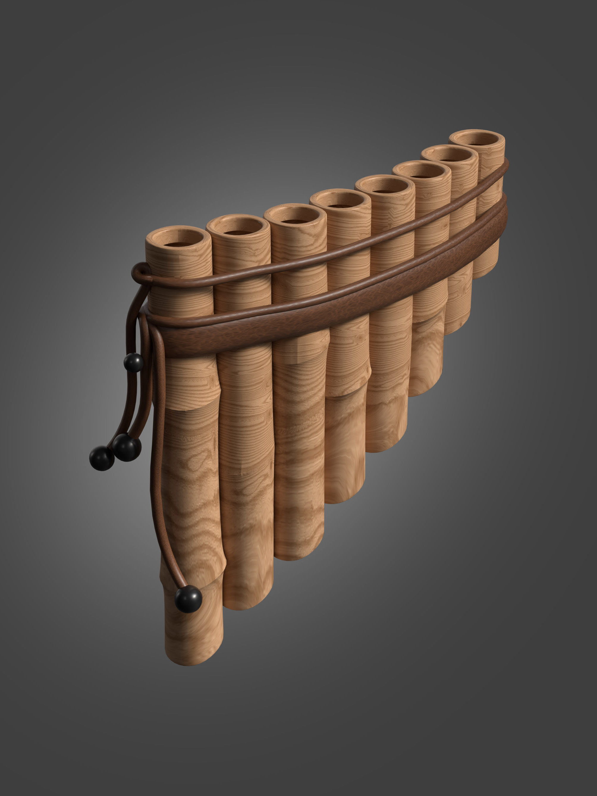
Mood board:
I love to cheer up myself with a bit of mood boarding and exploration around visuals, colours, forms,... it's amazing to see such a huge amount of brilliant work is out there to inspire us.
Images found on Pinterest. All credit are reserved for the orginal creators.
Sketches:
It should be fast and dirty, right? I'm trying to not use paper anymore but instead, I'm using digital ways to sketch. In this specific project, I ironically used an app called Paper. Procreate, Adobe apps like sketch or Fresco and even iOS note app would be more than enough for these use cases.
It should be fast and dirty, right? I'm trying to not use paper anymore but instead, I'm using digital ways to sketch. In this specific project, I ironically used an app called Paper. Procreate, Adobe apps like sketch or Fresco and even iOS note app would be more than enough for these use cases.
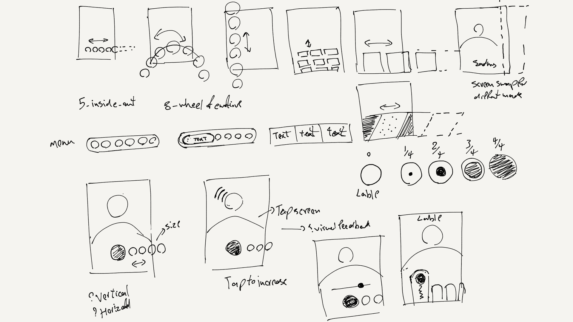
Quick sketches for illustrate the flow.
Wireframe:
I used Adobe XD to wire-frame and design the UI. There might be better tools out there like Sketch or Figma but when it comes to small projects as far I use Adobe products, it makes sense for me. On the other hand I really think Xd is one of the best from Adobe and could change the rest of the family by it's iterative approach.
I used Adobe XD to wire-frame and design the UI. There might be better tools out there like Sketch or Figma but when it comes to small projects as far I use Adobe products, it makes sense for me. On the other hand I really think Xd is one of the best from Adobe and could change the rest of the family by it's iterative approach.
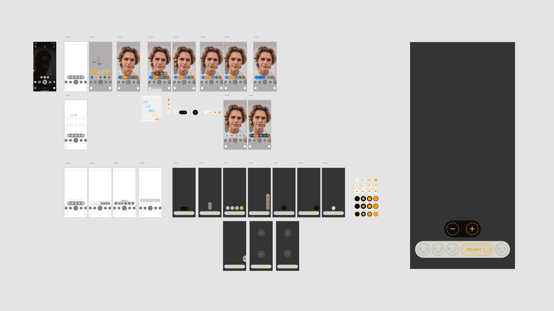
Exploring different ideas for the UX/UI design
Visual Design:
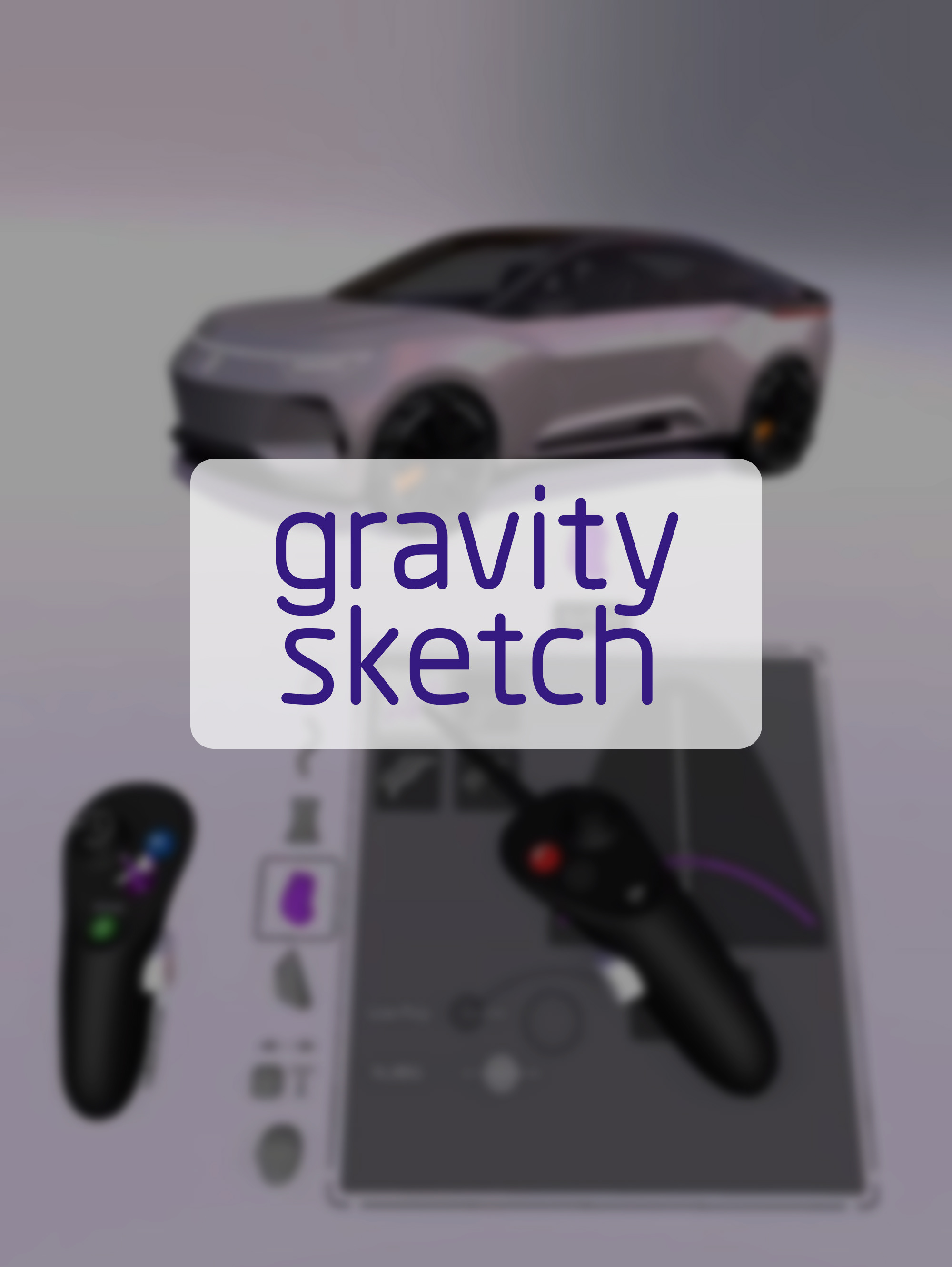
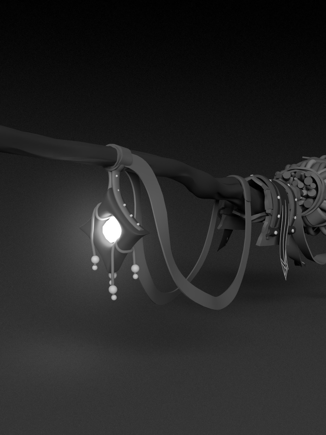
I used Gravity Sketch app on Oculus Quest to design/model the face bits. I'm not a 3D designer but VR medium and apps like Gravity Sketch empower you to try and achieve new things.
I used Gravity Sketch app on Oculus Quest to design/model the face bits. I'm not a 3D designer but VR medium and apps like Gravity Sketch empower you to try and achieve new things.
Quick VR sketching to explore different shapes and pattens.
Prototyping:
One of the main reasons that I started to work on this project was a bit of understanding about Spark Ar Studio and it's capabilities and knowing where it could go.
It's the Facebook augmented reality platform for creators. I'm sure you've tried a few IG effects that have been build using Spark. I love the fact that you can build your AR experience without writing a single line of code, although I used visual programming to design the logics and interactions.
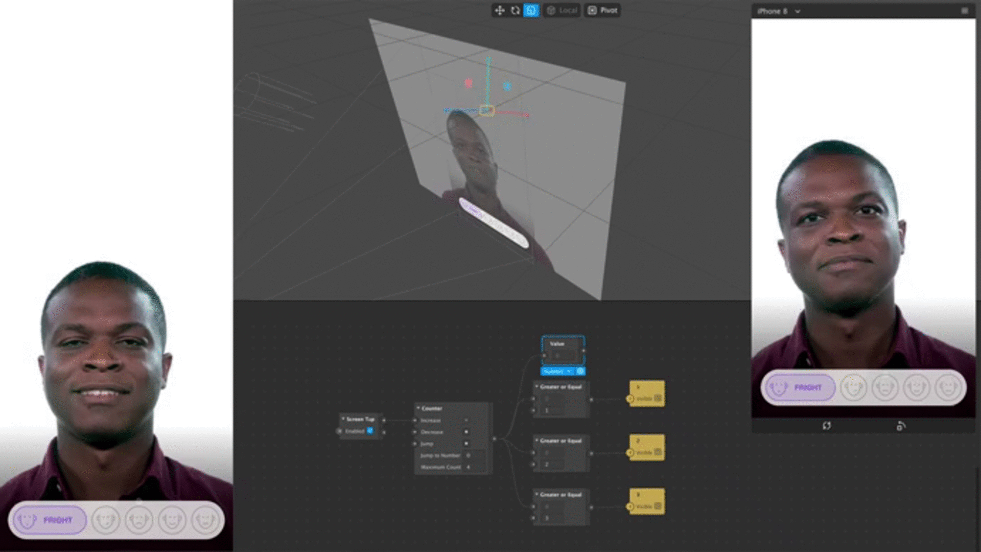
Prototyping the UI interaction in Spark AR Studio.
Summary of feedbacks:
Yes, it was my idea but if people find it hard and unpleasant to use, it would be meaningless. Yes, it's a personal project and I could just not care about others opinions and stick to what I think is better. But at the end of the day, this project is also a product which without a user, a happy user is nothing but a few pieces of design.
By running a few tests among friends and colleagues a few issues started to pop-up:
- I'de like to know what's the range of emotions.
- I just tapped more than what I wanted and now I need to go back from the beginning.
- Would it be better to give the user the option to not share her face and just have those bits on a flat face?
- Can I add a text?
- It could have a better how to use instructions
- It seems a bit hard to understand what do I do with the UI.
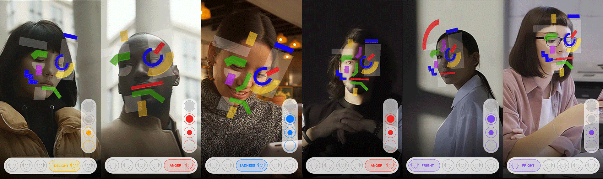
Sometimes you just want to make sure that you're doing the right thing and an expert could be your relief. Fortunately, I have a really good friend/ consultant who is always willing to help. Dr Rasti (Clinical Psychologist) kindly spent a few hours on a video call with me and I walked him through the initial sketches and results. With a few tweaks, we made sure that the project is on the right path. We decided to miniseries the amount of the color/ emotions to make it easier to interact with. I used the 5-Emotions model that you've seen in the inside-out animation movie.
Delight(Joy), Fright(Fear), Sadness, Disgust and Anger.
Delight(Joy), Fright(Fear), Sadness, Disgust and Anger.
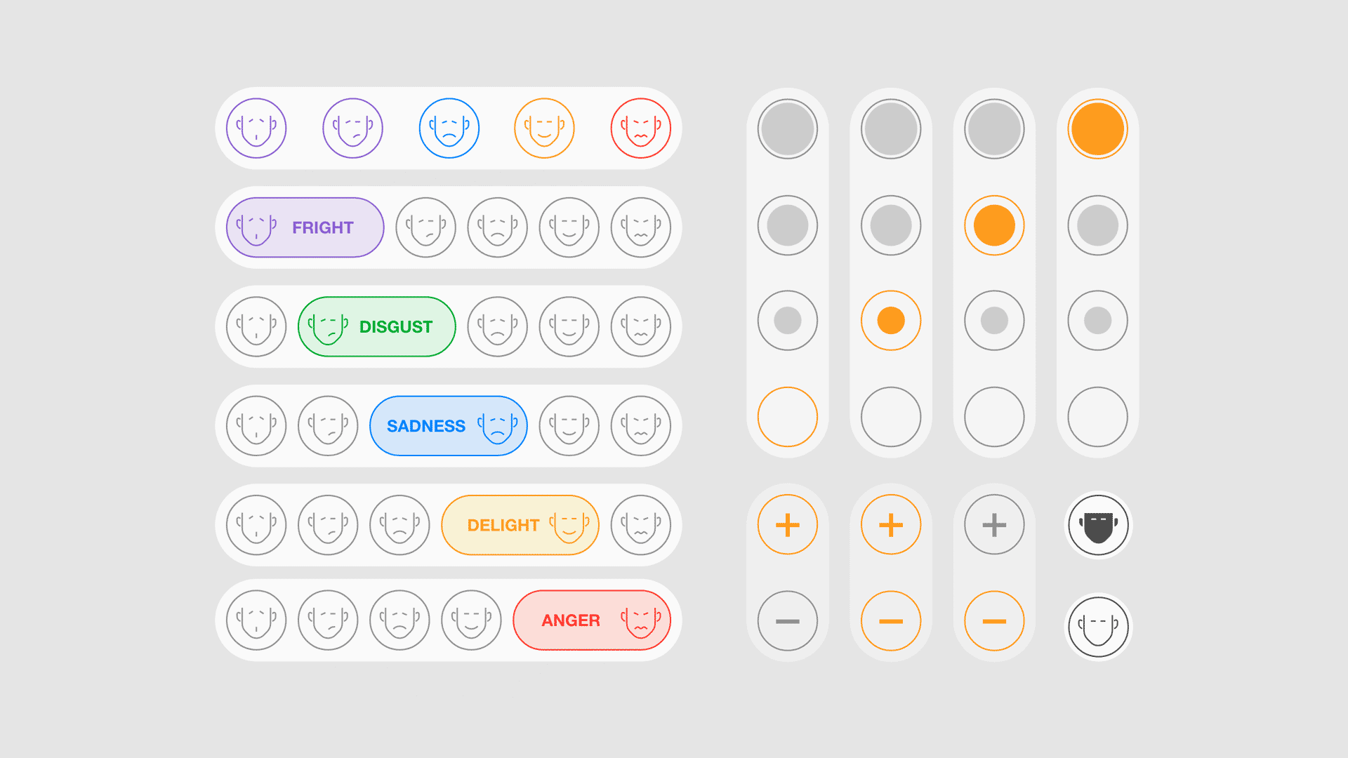
Creating Image sequences as the UI element's states.

Grouped and coloured using Adobe Dimension.
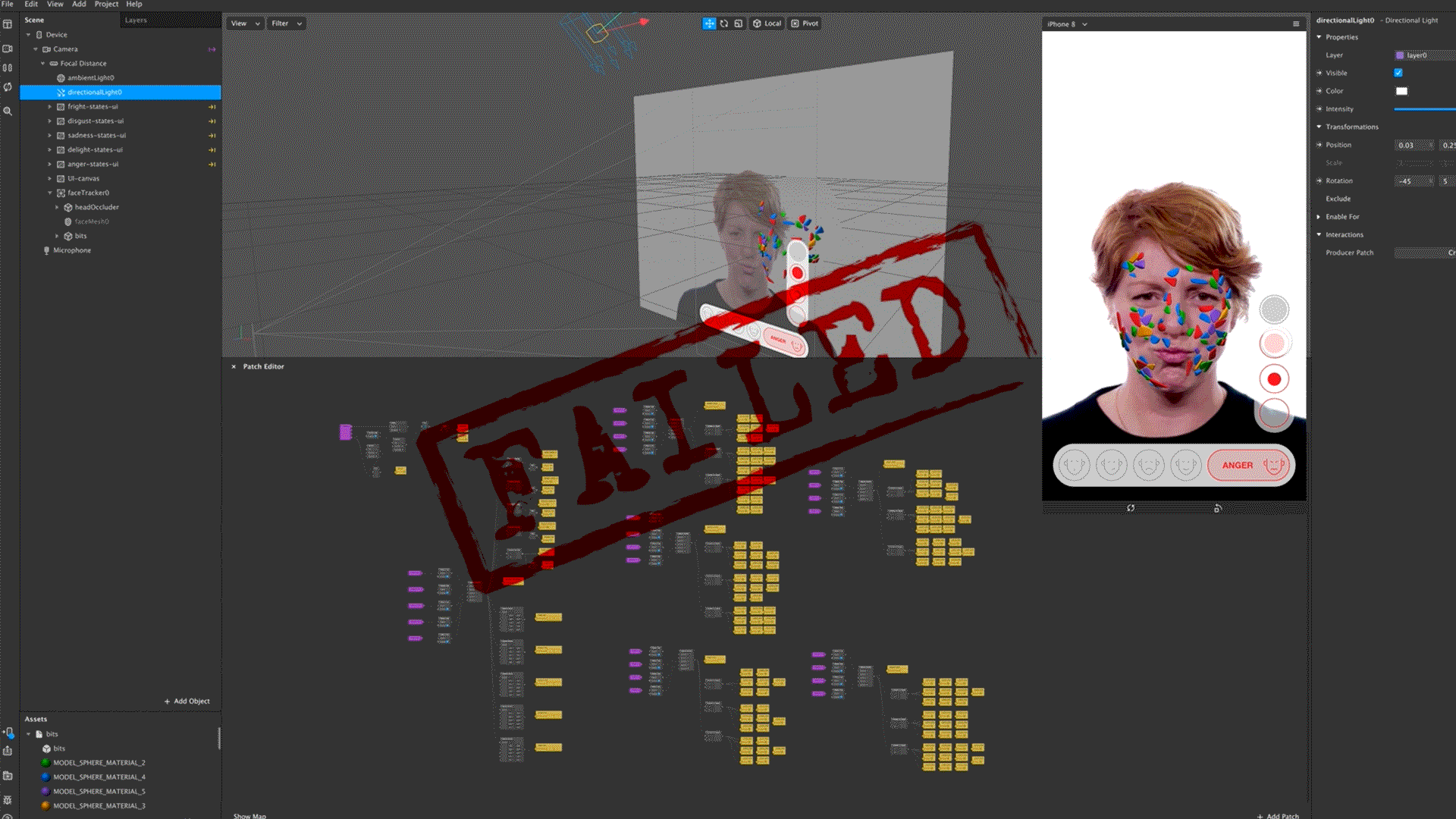
Failed!
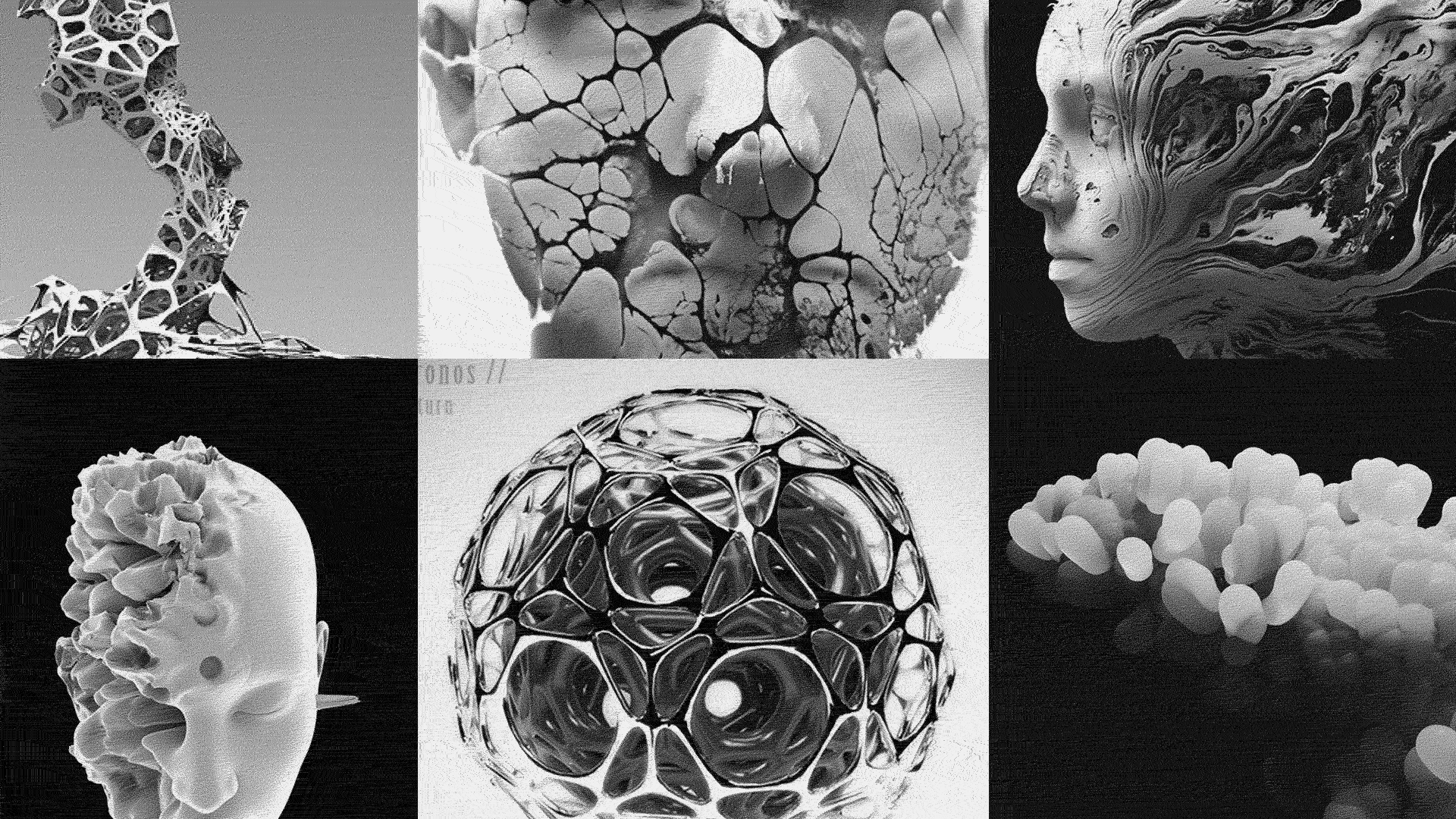
Failure:
Sometimes you think you know, you think you're getting there but actually, you're going away! It happened to me when I was working on the stone-bits idea. It was going alright and I spent a hefty amount of time on that but in the end, I realized that it doesn't work. So I stopped pushing that further and took a few steps back and thought about new possible approaches for visual design. I came up with two ideas, quickly tried them and asked for feedback and guess which one won? Yes, you already know that.
Sometimes you think you know, you think you're getting there but actually, you're going away! It happened to me when I was working on the stone-bits idea. It was going alright and I spent a hefty amount of time on that but in the end, I realized that it doesn't work. So I stopped pushing that further and took a few steps back and thought about new possible approaches for visual design. I came up with two ideas, quickly tried them and asked for feedback and guess which one won? Yes, you already know that.
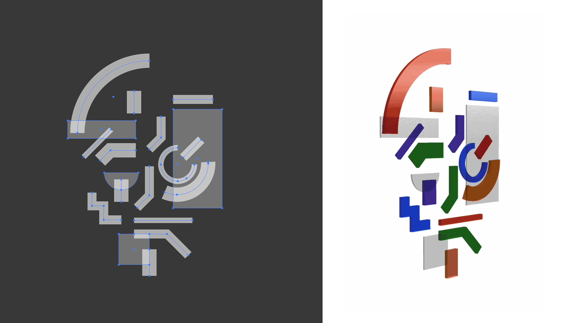
Illustrated the main shapes in Adobe Illustrator, Extruded in Adobe Photoshop and tided up in Adobe Dimension.
Apart from doing the study and the user tests, It took me about 25 hours (over 5 days) to get to this point. As I said before this is still work in progress and I will appreciate any feedback.
The next step for me is to explore deeply about facial triggers and interaction in Spark AR and see if it's doable to create some sort of logic to read your face and rate automatically based on that. I know that you could measure month openness and use that to trigger different states, but let's see.
Thank you.