Client: Tvori
Duration: Six months and ongoing (part-time)
Role: Design Lead
Deliverables: Product design, User research, Visual design, Strategy and process design
Duration: Six months and ongoing (part-time)
Role: Design Lead
Deliverables: Product design, User research, Visual design, Strategy and process design
Due to an NDA, I can't show all the specific details of this project.
Summary
ShapesXR is a collaborative design and prototyping tool for AR, VR and any spatial experiences. It provides remote product teams with a tool for brainstorming & ideation in 3D, rapid prototyping, instant sharing and real-time co-editing.
Relying only on tools, devices and platforms that aren't built with Spatial design needs in mind, could lead to expensive, lengthy pipelines and not optimised and well designed/ tested solutions. Simply trying to review a VR interface design on a flat 2D monitor won't work, as you won't be able to see that in its accurate context.
I've been working on several features and improvements for Shapes XR, such as the new interface, UX improvement, Prototyping feature and onboarding. I've also created a few samples to demonstrate diverse use cases for the app. It's now available through App Lab for Quest and Quest 2 devices.
New UI
To understand the actual pain points and pick up a more user-centric design approach, I started planning and conducting user research. Analysing both qualitative and quantitative data from multiple surveys, user interviews and moderated meet-ups, we realised we need to start from the UI.
Having a diegetic UI in VR sounds like a must but if you don't consider the possible clashing with the actual environment, it could easily get out of hand. The old user interface was described as "Too much", "fighting for attention" and " a blocker".
Old UI
The old UI was always available in front of the users, as a shelf. All tools and settings were presented in the same way which made it difficult and confusing to distinguish and use. On the other hand, you would have the UI clashing, as soon as you start bringing 3D objects into the scene.
Design Process
I planned a design sprint and asked all team members to participate. The initial plan was to have a 5-day sprint starting from the definition, going through ideation, prototyping and finally testing the solutions with the end-users. Although we started very well, we have learned that we can't always expect the"prototyping" to be done in one day. We used this learning and planned the next design sprints with a flexible prototyping period.
Flexible sprint
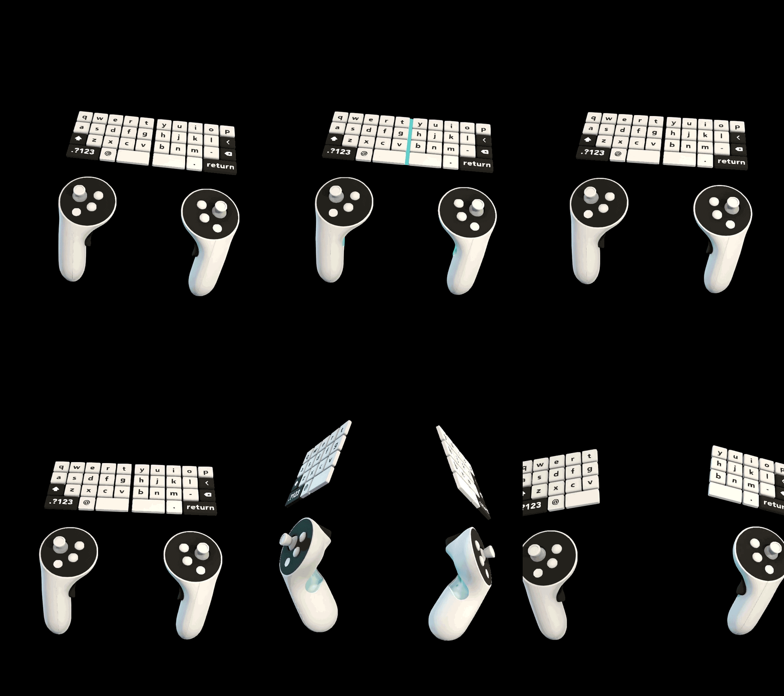
We started with a competitive audit, studying different approaches to VR and diegetic interfaces. After exploring direct and indirect competitors and also VR games, one of the best paths seemed to be a handheld menu. Having technical limitations, we moved to the ideation phase. We didn't restrict everyone to ideate and sketch in VR and that allowed us to have more inputs. In the end, we landed on the hand-held UI for both menu/ settings and toolset. As we were going to add more specific controller mapping we limited that to only one controller at a time. You can always change that if you are left-handed.
Competitive audit
The video below shows the design process of the new UI. At this stage, I used my own XR wireframe kit that I've previously built for Gravity sketch and that helped me to deliver quickly, but since we implemented the new UI we've been using ShapesXR to design and build new features and improvements.
After we agreed on the final UI, we quickly built an interactive version of the UI and tested that with the same group of people who previously participated in the first usability test. Back then, the audio recording was not available on Quest, hence we had to find another way. I suggested building an interactive questionnaire inside the app and asking participants to record a video while going through the prompts. In the end, we used an interactive panel with multiple prompts to observe the user's interaction with the menu plus a system usability scale to finish the test. Comparing the results clearly showed a massive improvement in the Usability and adaptability of the new UI. Having unmoderated user studies helped us to observe user's behaviour in a more realistic context.
Due to an NDA, I can't share all the details of these user studies.
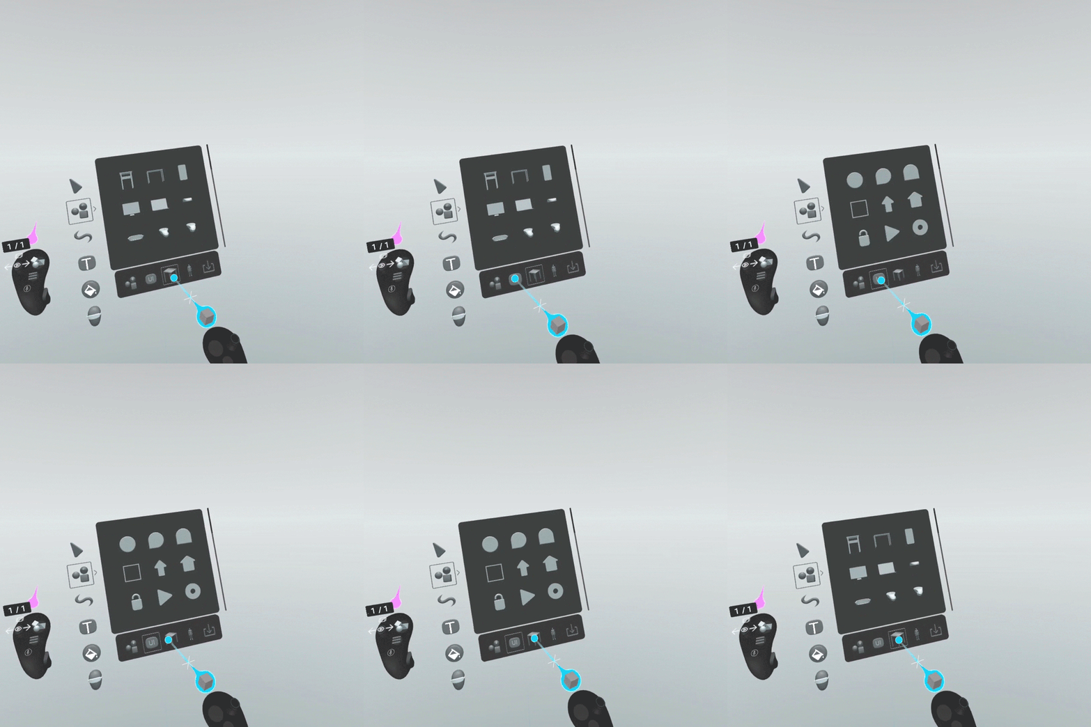
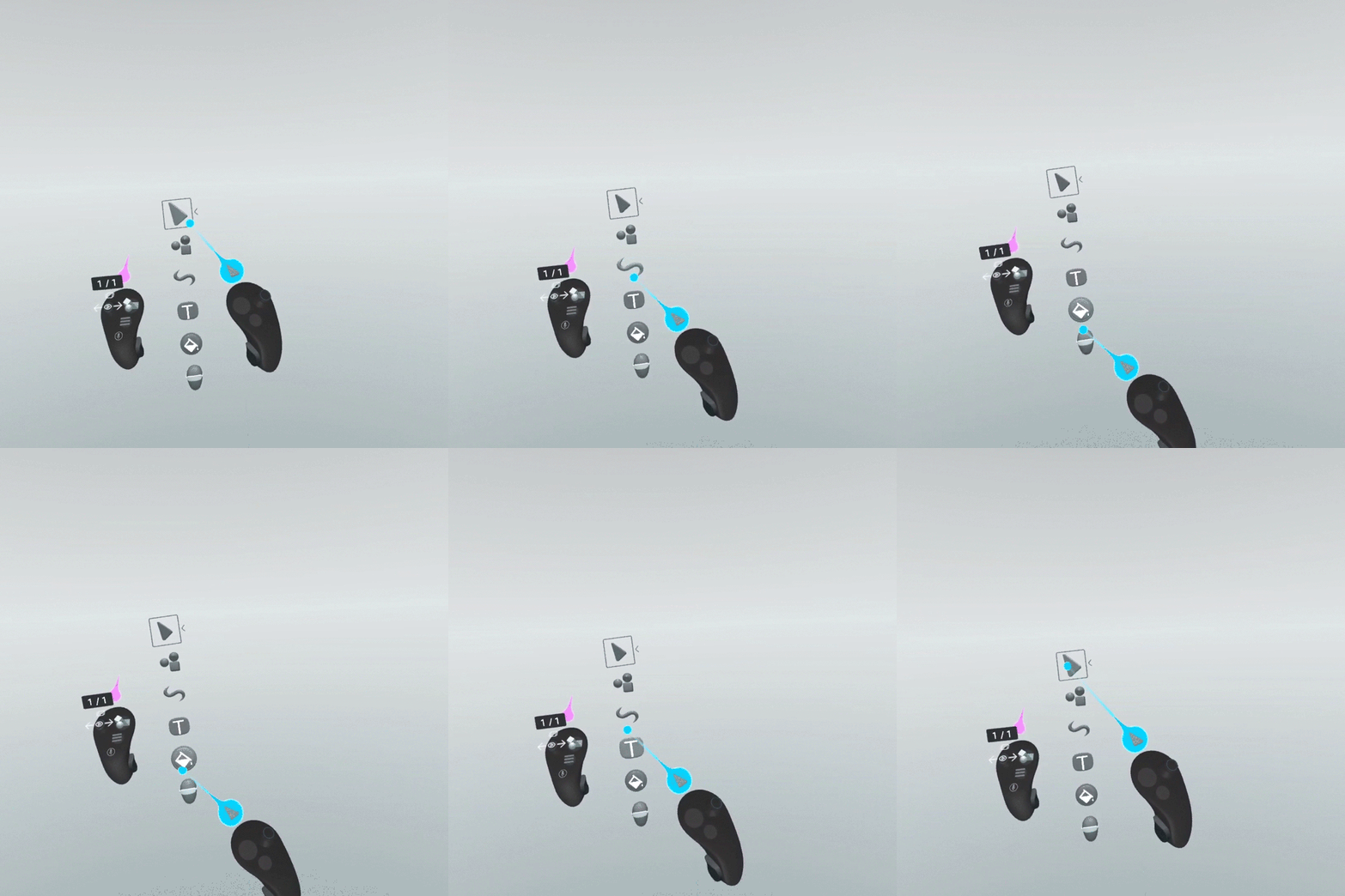
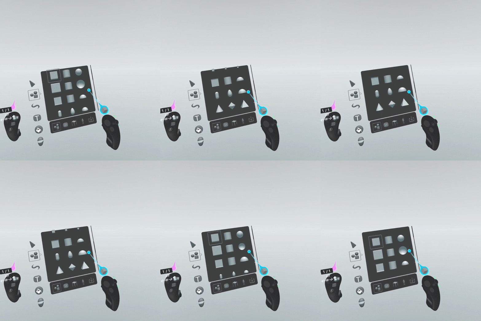
Design Guidelines
When you go fast, you won't see the details. As we were iterating rapidly, we needed to keep our UI consistent. Therefore I designed a very basic design guideline. It is still immature and under progress, yet helpful and time-saving.
Stages (Prototyping) Feature
Conducting many user interviews, surveys and also studying the existing XR design pipelines, one big missing feature was prototyping.
Being able to show different states of an idea or product seems to be the most challenging step in the XR design process. It requires using Game engines like Unity and programming skills. Even if you're a unicorn with all those skills or lucky enough to have a team of dedicated specialists, it would stretch the product delivery timeline.
Studying the prototyping tools while considering our limited resources, we decided to go with a simple storyboard-like approach. Complicating this feature and bombarding users with many settings would be against the idea of rapid prototyping, doing something quick and dirty.
The stags feature in Shapes XR allows you to create, delete, duplicate and rearrange stages. Each stage could contain different objects or the same objects with different characteristics such as position, scale, colour,...
The stags feature in Shapes XR allows you to create, delete, duplicate and rearrange stages. Each stage could contain different objects or the same objects with different characteristics such as position, scale, colour,...
After testing the first prototype internally, we realised we need an additional feature to copy or move objects between stages. We first started with a clipboard, with limited pockets for objects to be placed and dragged from. It worked fine but we simplified that into a simple grab and move switch between stages.
Samples
To help illustrate the diverse use cases of Shapes XR, We needed a few sample scenes to be added to the lobby. These samples are also available to be used as templates and accelerate the ideation and design process. The following samples are designed using the basic capabilities and just with the available primitives without any imported assets.
To be continued ...
